BVG
Description
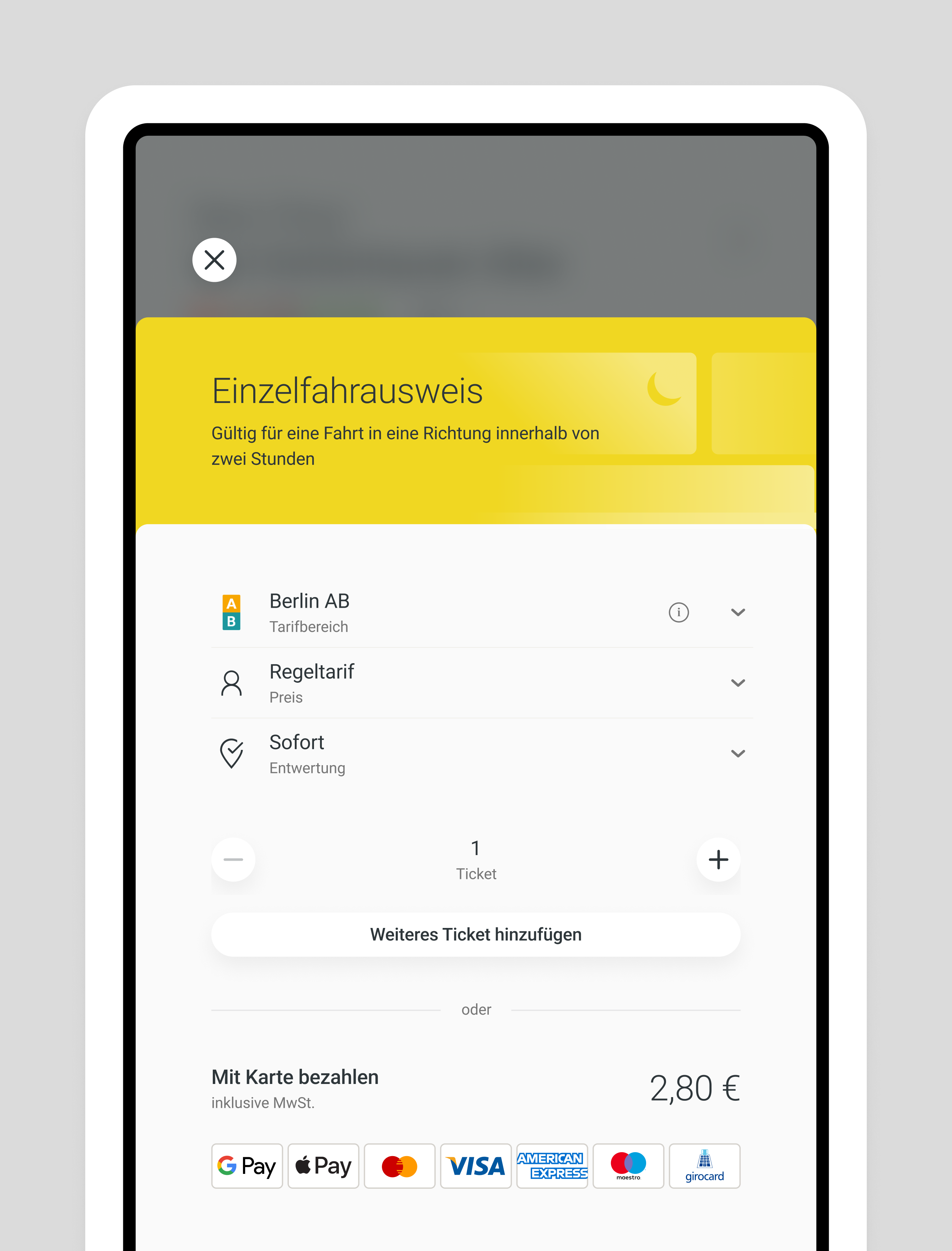
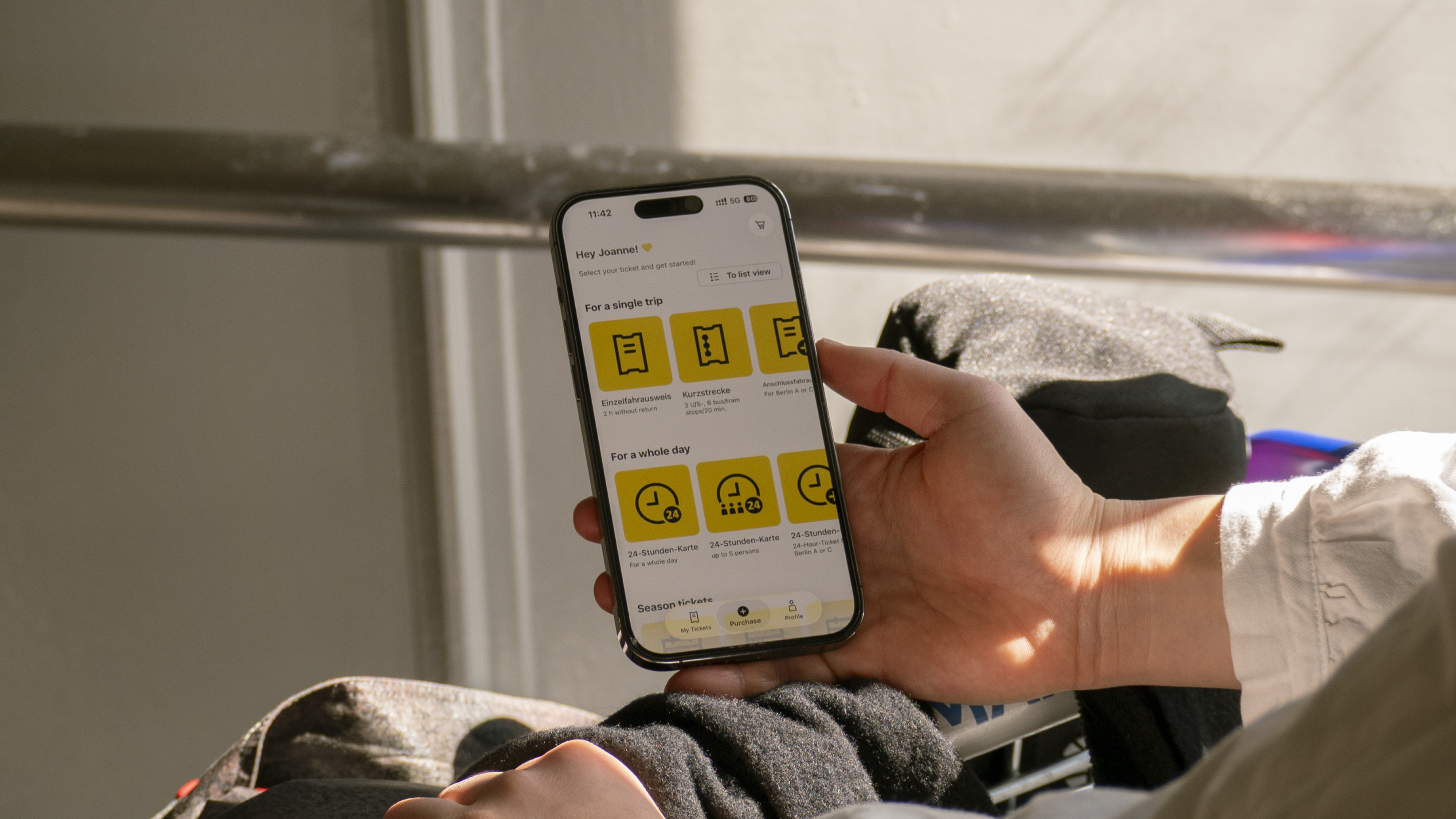
Like many city transport systems, the ticketing experience felt like it stood in your way.
We reshaped it for Berliners and tourists alike.
Reducing friction has been a guiding principle from day one and still informs every decision. In transit, small obstacles
compound fast. A confusing flow, an unclear label, a layout that shifts between screens: these aren’t minor inconveniences,
they’re the difference between a missed connection and a smooth journey. Getting out of the user’s way matters.
The app serves a diverse audience, each with their own needs. So we built a design system flexible enough to adapt at its core.
For BVG, that means a single source of truth: consistent components, clear rules, and the ability to evolve without starting over.
For riders, it means a cohesive experience that feels familiar whether they’re buying a ticket on their phone or at a kiosk across the city.
Credits